AI can generate a landing page in seconds now. What it can't do is judge what it has created as inconsistencies in its design language or communicate a product and brand identity that is incoherent. That's the gap I wanted this project to prove.
I used Claude and ChatGPT throughout this project for first drafts, research, and exploring directions I hadn't considered. But nothing here shipped because the AI said so.
AI allowed me to produce a draft faster and put it in front of stakeholders quicker than ever before. Everything after that (what to keep, what to throw out, what a brand should actually feel like) was my design thinking.
ABOUT THE COMPANY
Second Wind Pro is built around the athlete: from representing them, helping them manage their money, and soon, giving their coaches a platform to build and manage rosters. The company's goal is to become the frontrunner in this rapidly growing and increasingly competitive sector.
OVERVIEW
During my internship, Head of Sports, Lenny MelzerLenny Melzer, approached me to redesign the company's website because its content, visuals, and brand identity were outdated and failed to highlight the company's unique value in the NIL (Name, Image, and Likeness) realm.
CHALLENGE
No design assets were established, except for a logo and their main color, purple.
Since that was all I had to work with, I built a design system from version 2 of the website onward, using Claude Design, and kept updating it to stay visually coherent as new use cases came up.
SWP design system (Click to enlarge)
FINAL OUTCOME
The redesigned site shipped and is live on Netlify.
Lenny had shared an LLM-generated prompt that outlined his vision for the website. It was remarkably detailed, defining the site's content and information hierarchy, but it left the brand identity largely unexplored.
At the time, I was still building my understanding of NIL and the research behind the Second Wind Pro AI platform. This project became an opportunity to move beyond simply organizing content and instead interpret how the company's mission, research, and product vision could be translated into a cohesive brand and user experience.
To gain further clarity, I copied the prompt that Lenny had sent over on Slack and pasted it into Claude with some direction:
ClaudeDesign brief
You
Imagine you're a web designer. I need to design a landing page for Second Wind Pro with this format and layout. Make the background dark mode; their main color is purple. The hero section should be a sporty, inspirational video intro, but at the same time, keep some sections from the old website the same, like our services and how we work. Make it creative.
Claude produced version 1 as a hypothesis: as a way to gather insight on the aesthetic direction and meet stakeholder expectations halfway.
EngineerJack
Industry knowledge I leaned on for this
“But the going trend is modern everything. Where it's at right now is more toward a high-end consulting firm. The elements I think are fine (banners, cards, etc); I bet if we choose a more blocky font and tighten up the dead space.”
CEOLuke
Brand identity feedback
“The aesthetic is leaning too far toward a high-end law firm. We need to capture a feeling that actually represents our brand identity.”
WEBSITE AESTHETIC EXPLORATION
That feedback sent me exploring the NIL agency space, along with sports-adjacent brands:
,, and.
I wanted to understand two things from them: the tone and language of their copy and microcopy, and the feeling their aesthetics conveyed, especially typography.
I looked closely at Nike's typography specifically, since it has the “blocky” feel that Jack and LukeLuke Mazur both desired. That led me to ask ChatGPT:
ChatGPTTypography research
You
What are some examples of blocky fonts for sports agencies that are sans serif?
ChatGPT
Returned a list of sans-serif options, including fonts described as “Modern”
The output it generated didn't look much like Nike's type until I noticed the word “Modern” in one of the descriptions. That was the actual feeling that was being asked of: not a sports-magazine aesthetic like v1, but something between formal and informal, fitting given the site's real audience is brands, athletes, and athletes' guardians. That “in-between” needed to show up not just in the aesthetics, but in the copy, microcopy, and accessibility of the design itself.
Typography
I chose Geist for its legibility, clean look, and large display size across sections, and because it sits right in that formal/informal middle ground the brand needed, leaning toward neither.
Colors
Version 1 had an almost-black background with a touch of warm purple and cream text against it. I liked it at first; the contrast was there. But sitting with it longer told a different story. My eyes kept sliding off the page, and so did the stakeholders'. The background was too strong.
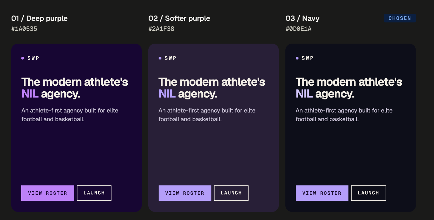
Color direction comparisons (Click to enlarge)
The fix wasn't about accessibility; it was about how the page felt to spend time on. Second Wind Pro AI, our internal dashboard, used a #1A0535 deep purple as its baseline, so I tested three directions off that: a saturated deep purple, a muted soft purple, and a navy-leaning version. I dropped real site content into each and picked the navy version: the one that let the content stand out instead of fighting the background.
WEBSITE SECTIONS EXPLORATION
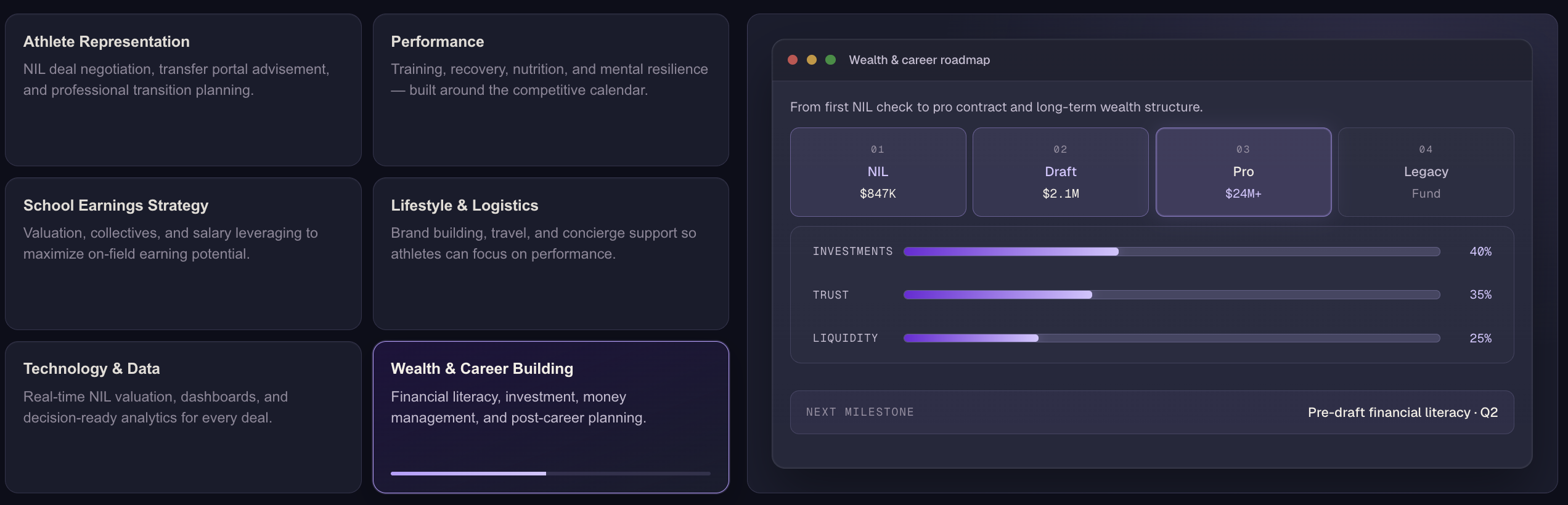
Our Services
v1
V1 was about reading stakeholder expectations, not final craft. The services section worked as a draft, but leaned entirely on text descriptions with no visuals doing any of the work.
Shifted from a mouse-animated horizontal scroll into bento-box visuals. Reading all the service descriptions at once felt overwhelming, and it didn't match how most landing pages actually use bento layouts to communicate a solution.
Services exploration #1 (Click to enlarge)
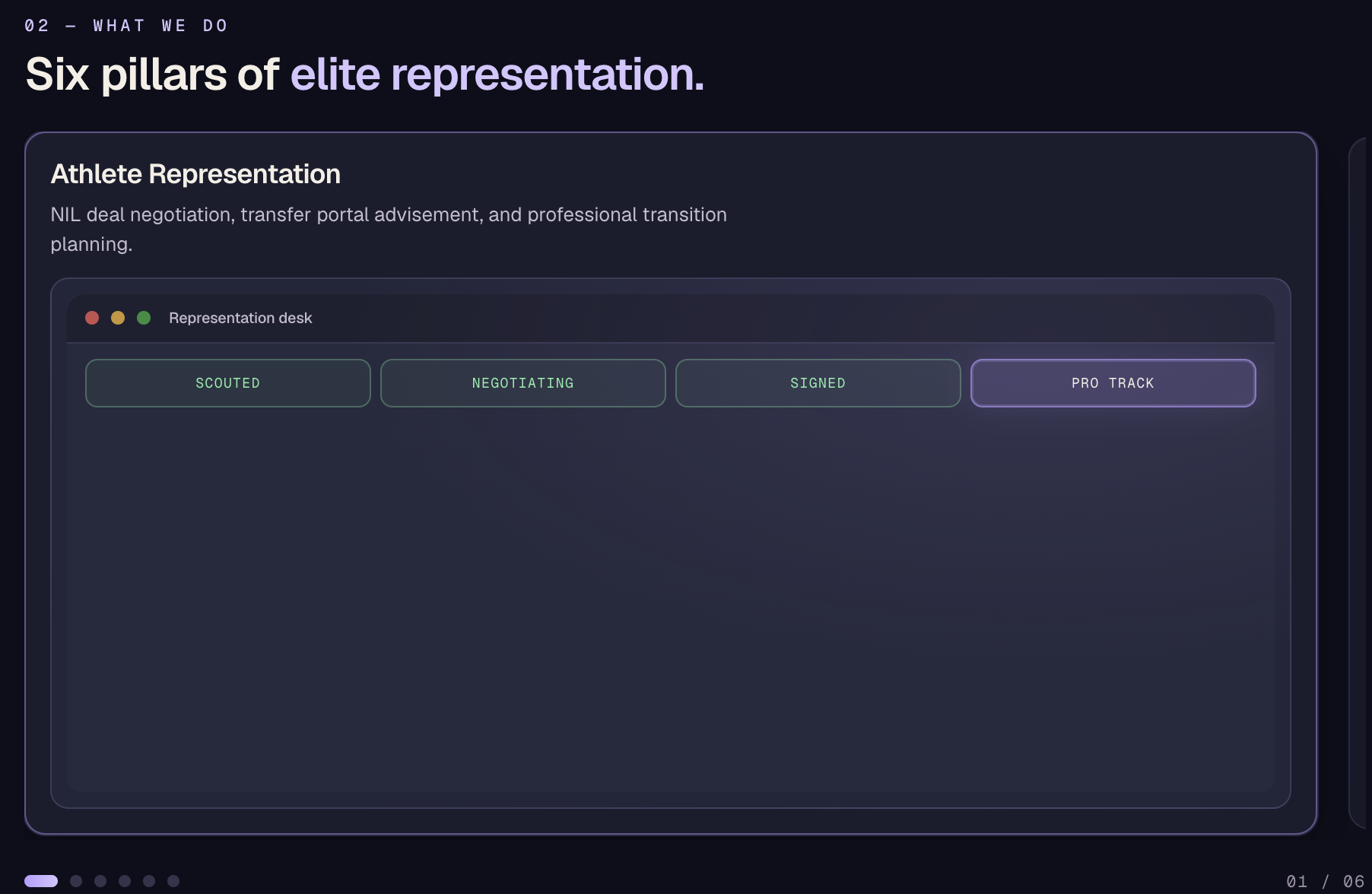
v2: Exploration #2
Focused on individual services one at a time, using a carousel to create a “hook effect”: pulling users in by surfacing one service at a time instead of all at once.
Services exploration #2 (Click to enlarge)
v2: Live
The live version keeps the hook effect: to learn more, users scroll vertically or can click into individual services.
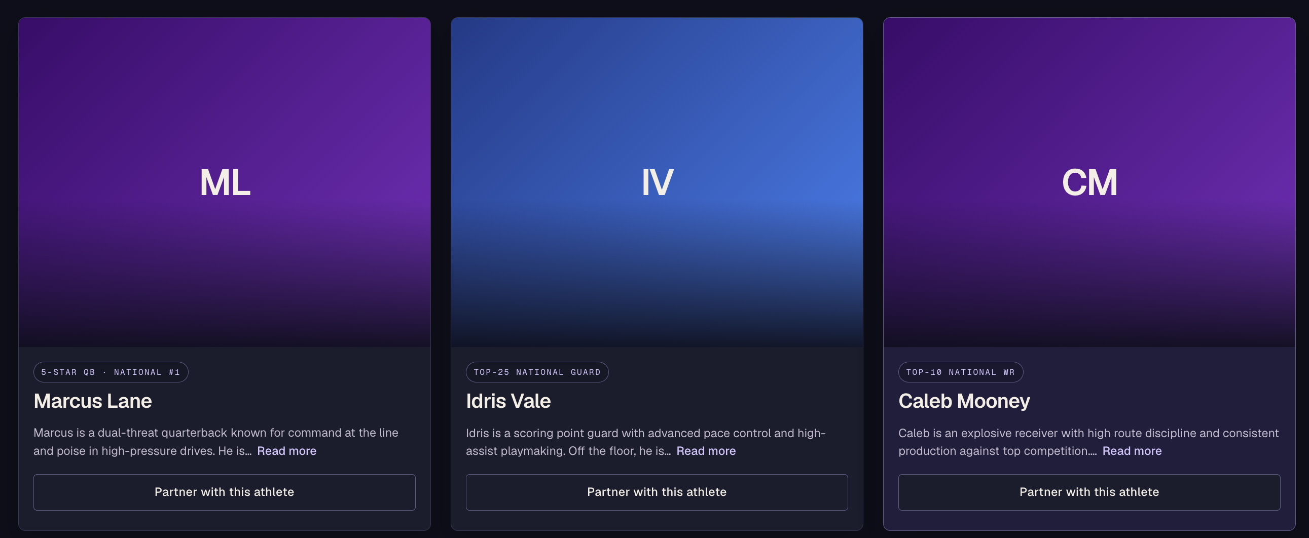
The first pass used a responsive card layout for player profiles. Two problems stood out: the two buttons (Read More / Partner Up) competed for priority with no clear primary action, and the spacing around each card's content felt heavy on the eye.
Athletes exploration #1 (Click to enlarge)
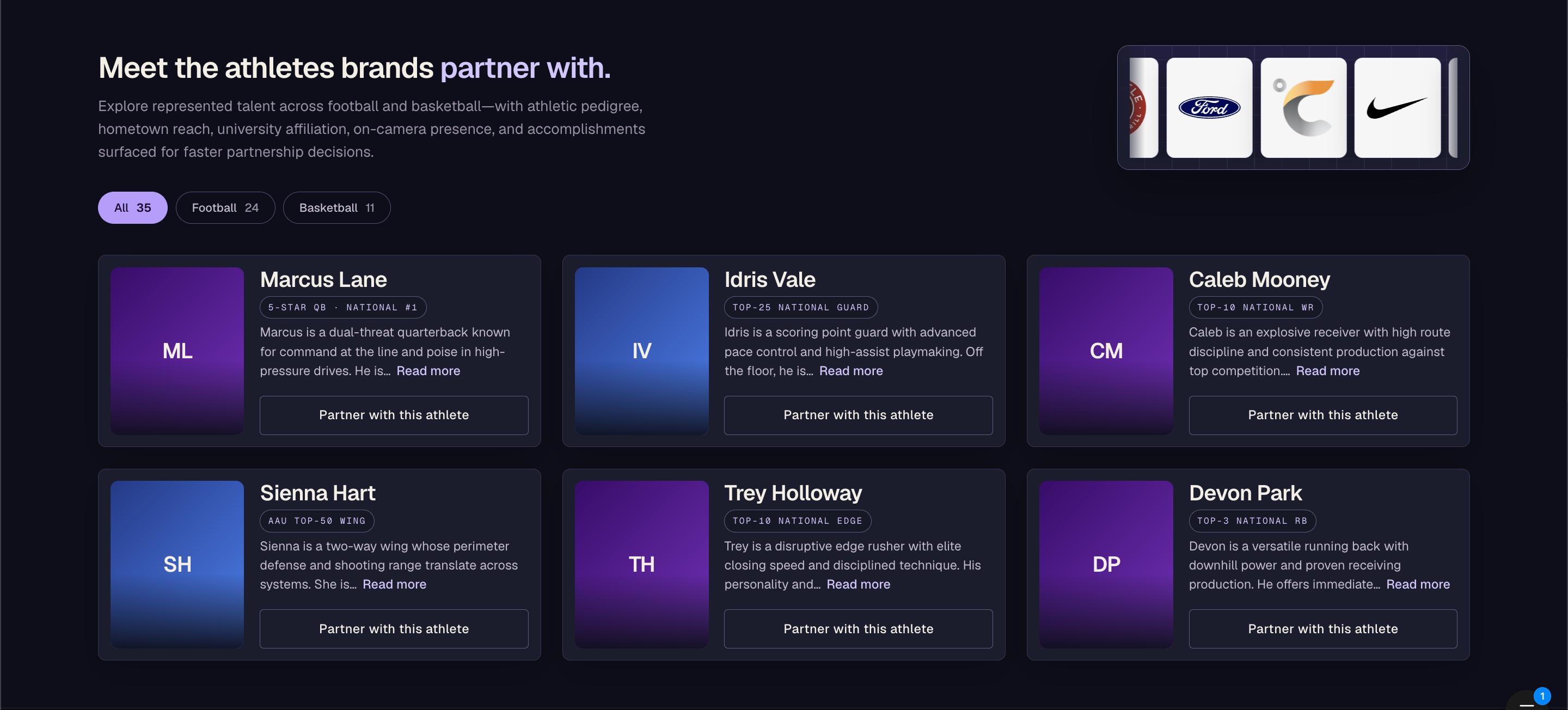
Approach #2
This iteration moved to a horizontal card layout to fix the spacing and repositioned the pills above the player's name instead of below it. Card body spacing still needed work.
Athletes exploration #2 (Click to enlarge)
Collaboration
At this point, I checked in with Lenny on progress. He said, “I like the progress 👍,” and then asked something that reframed the whole page: the agency represents 30+ athletes; could the current design actually support that number and more?
“No,” I said. “Anything more than six athletes would cause information overload.” I was wrong, but not about the overload. I was thinking about the content when I should have been thinking about the page's goal: helping brands find a player worth partnering with, not showing them a manageable number of faces.
That reframe changed the card design too. The partner button now lives inside the athlete's detail view, not on the card itself. The decision comes after the reading, not before it.
Once the goal was right, the rest followed from it. Pagination would break browsing every twenty athletes. A load-more button would ask brands to keep opting in before they'd found what they came for. Infinite scroll keeps them moving until a player earns a closer look.
Approach #3: Live
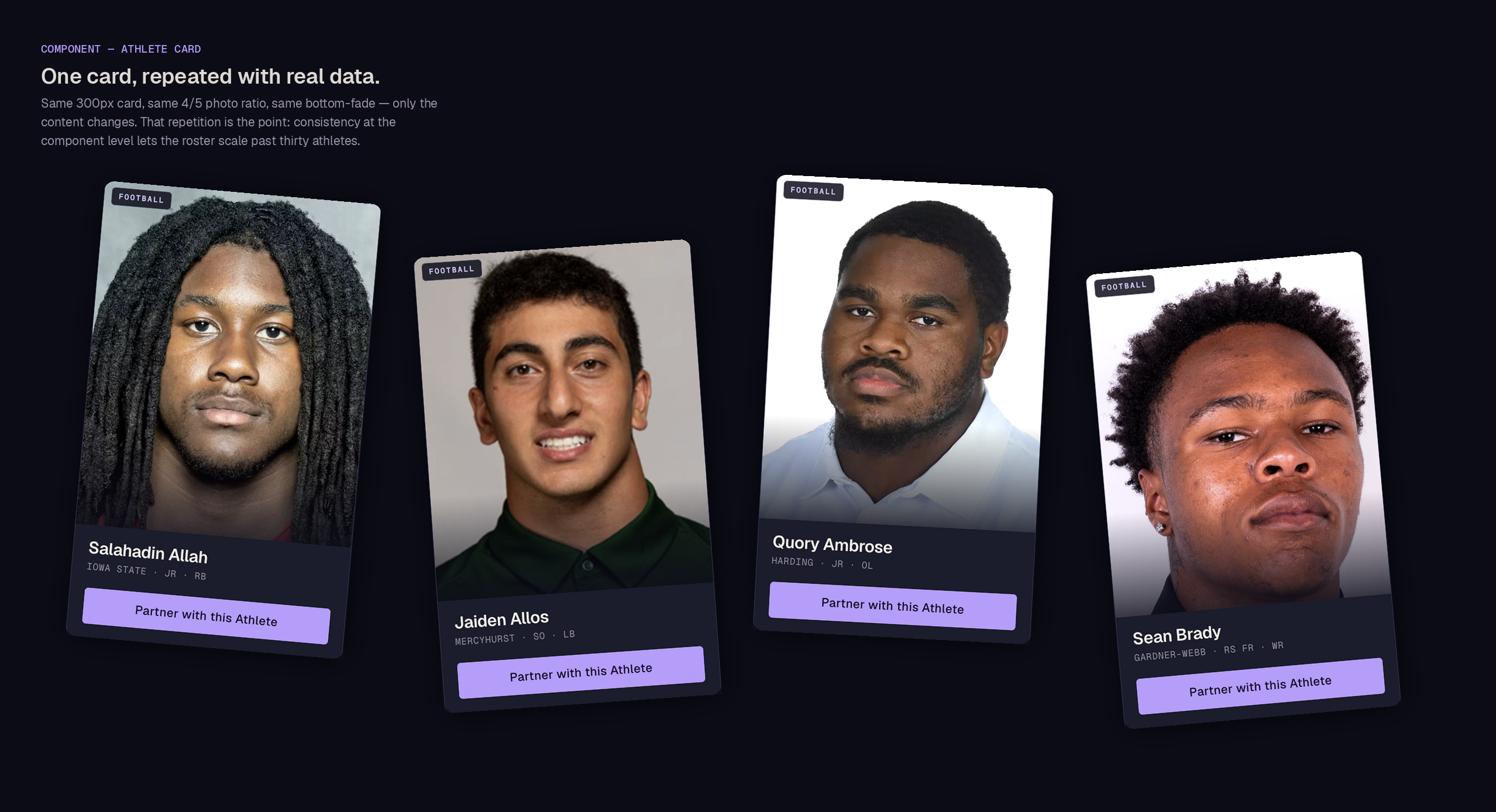
The final version fixes the spacing, includes real athlete photos, and holds all 30+ athletes without the overload I'd originally worried about.
The redesigned site shipped and is deployed on Netlify. I also presented the final version at a team stand-up, and both Lenny and Luke responded well to it. That mattered most for Luke: specifically, his earlier feedback on v1 was that the design felt like “a high-end law firm” rather than Second Wind Pro's own identity. Seeing that concern resolved in the final version confirmed the aesthetic exploration had actually gotten the brand identity right, not just landed on something “nicer.”
An internal tool built to bridge the gap between Cursor and the deployed site
Redesigning the site surfaced a workflow problem of its own: every mobile or iPad check meant committing, deploying to Netlify, and looking again. I built a local, Figma-like sandbox between Cursor and the live site so I could preview drafts across breakpoints without that loop.
Knowing who the section is for matters more than anything else.
When I was clear about the user and the goal, the design decisions came easier. When I wasn't, everything got fussy.
Seeing designs live changes what you notice.
Reviewing them in a real browser instead of a static file showed things the mockup hid. Spacing looked fine on its own, but felt off next to real content.
Design tokens carry a lot of the weight.
Uploading the token file into Cursor kept color, typography, and spacing consistent across everything the team built after. Even sections I didn't touch stayed on-brand.
What I'm Proud Of
The system held up when real content came in.
Thirty athletes, a testimonials section, a brand pitch flow that wasn't in the original spec: the system scaled without breaking. Tokens and patterns did the work.
Next Steps
Train the judgment.
AI can animate code now, but it doesn't know what feels right. The skill I want to deepen next is knowing when motion helps the interface and when it's just noise.
Get access to better tools.
Mobbin's MCP and Refero would've shortened the reference-gathering phase and given me stronger backing for pattern decisions.